Millennial grey… that’s the name our generation gets for it’s design style. Personally, I’m offended. The rise of the grey home has gone too far and I like to call it the prison cell we’re all now stuck with…or we were.
After growing up in the 80’s and 90’s (for me it was all 90’s) Millennials were sick of the beige walls that most homes were coated in or the Tuscan dedicated home decor that trended in our parents home. In Millennial fashion (and honestly as all kids do) we rebelled to go in the exact opposite direction, a nice cool grey. But that’s the thing, it’s cool making our homes cold and sterile.
Now, 25 years after the Millennial grey mades its debut, I’m ready to call it out and go back to warm homes filled with color, pattern and (every interior designer’s favorite word) texture!
Download My Free Slow Living Library Here
by signing up for my free library you agree to be included in my ongoing newsletter.
How Instagram Influenced Our Home Choices
Millennial grey started as a way to rebel, but has actually turned into a way to conform. This is seen most prevalently within the influencer content on Instagram (and yes, you are being affected by it no matter how much you want to believe you aren’t.)
In the oh so entertaining, informative and life-giving book Momfluenced (seriously mom or not this book is gold!) Sara Petersen discusses how the increase of grey and white homes came to be through out over advertised culture. She goes into the origin story of Instagram and that the very first thought of this platform was to have a curated aesthetic. To create the “instagram Aesthetics” and while we can’t quite define it, we all know what it looks like, “White walls. Fiddle-leaf ferns. Blond wood. A this is luxe but I’m not trying too hard vibe. And when the Instagram founders decided to allow advertising on the platform, they chose their first partners strategically (Lexus and Burberry were two of those early collaborations), ensuring a certain level of luxury was conveyed by both the actual brands featured, and also by the aesthetics of the brands themselves.”
She further dives into the need for Minimalism after the 2008 market crash when less money was disposable at home. People got creative in their home designing and chose to make careful purchases. But once the economy was back up and running the “Minimalist” lifestyle took a turn and became a highly consumeristic market making it look like your home was orderly and calm but in actuality, we had more things than ever. “According to (Kyle) Chayka’s research, “The average American household possesses over three hundred thousand items. Americans buy 40 percent of the world’s toys despite being home to 3 percent of the world’s children.”
Aside from being brainwashed into buying more (Watch Netflix’s documentary, Buy Now: The Shopping Conspiracy to see just how far this goes) We are also brainwashed into believe that a specific style of home and decor deems us as better parents or more stylish people. “Why is her space aesthetically pleasing? Because many of us have been programmed to equate clutter with moral ineptitude, to equate soft, pale colors with soft, subdued femininity. Brightness can be loud, jarring; brightness can make us feel uncomfortable…White is a lot harder to screw up. As Kathryn pointed out, taking risks with aesthetics also “takes more work.”
Another reason for the all neutral homes was for advertising! Even I’m guilty of this in my own Instagram feed. You want the colors of the home to be neutral so that your product stands out. And while this is great for say, me, or Tide to use to highlight our products, your home should not be a backdrop for products. Your home should be a place that brings joy, grounds you, and tells your story. It’s an expression of who you are.
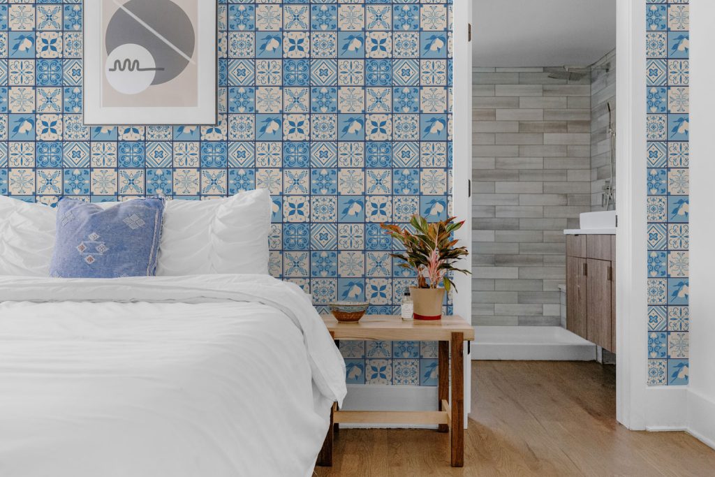
Bringing Color Back into Our Homes
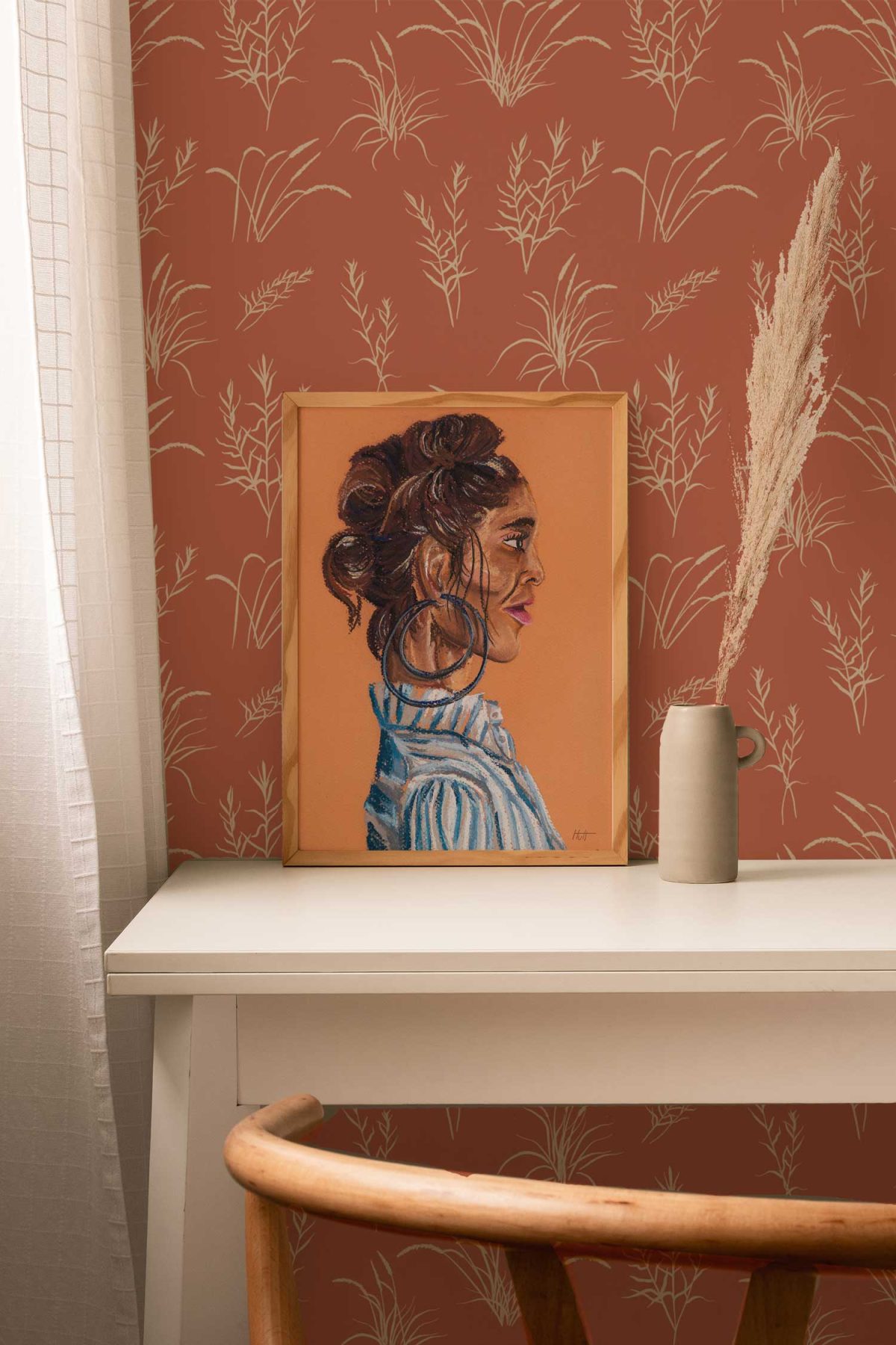
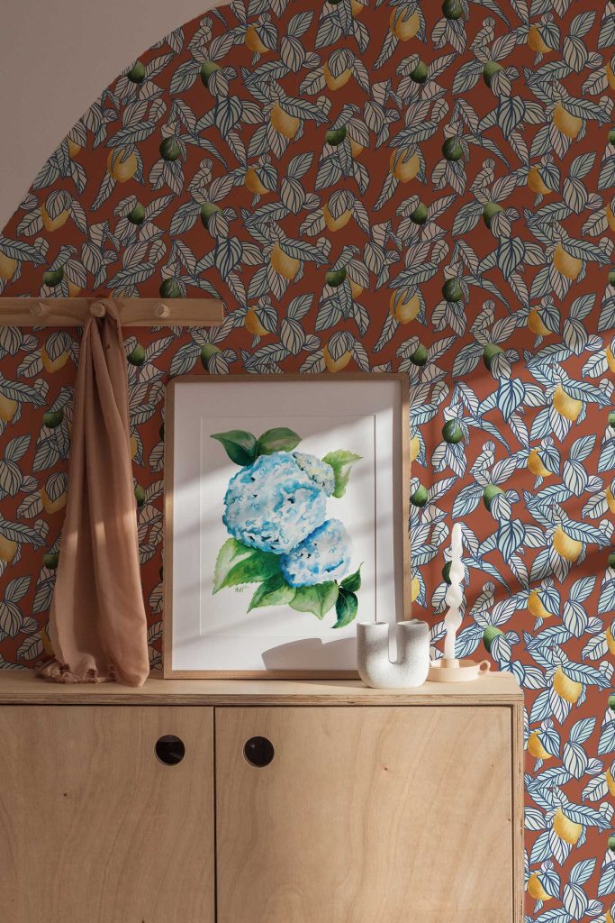
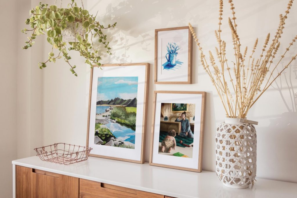
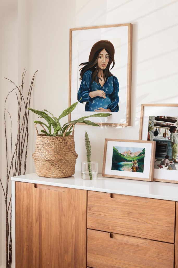
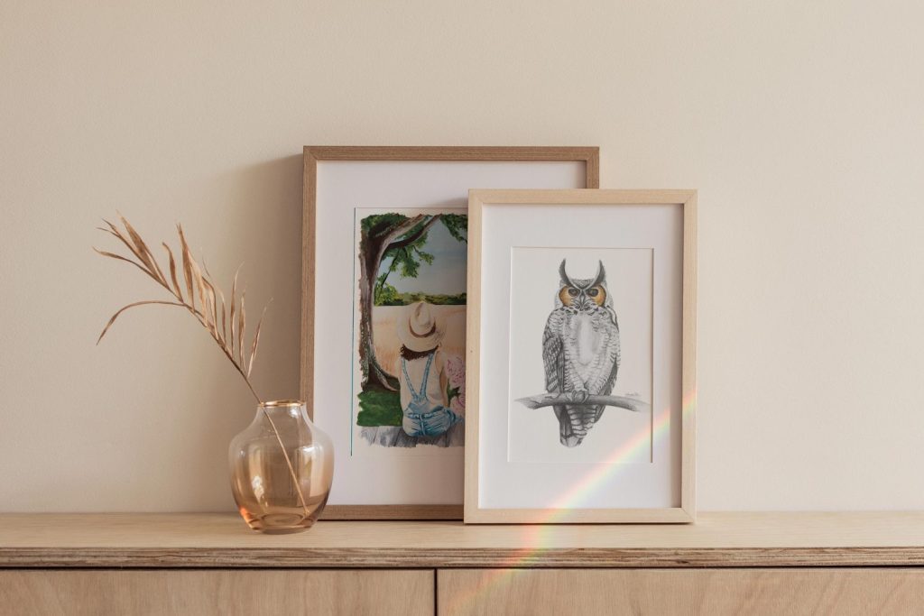
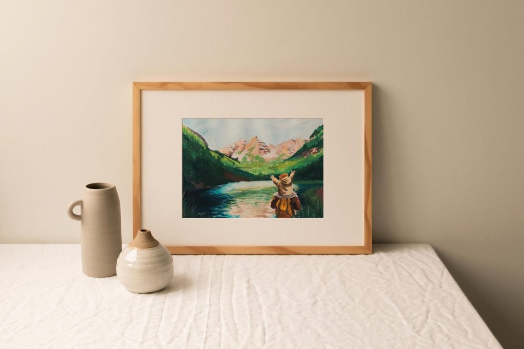
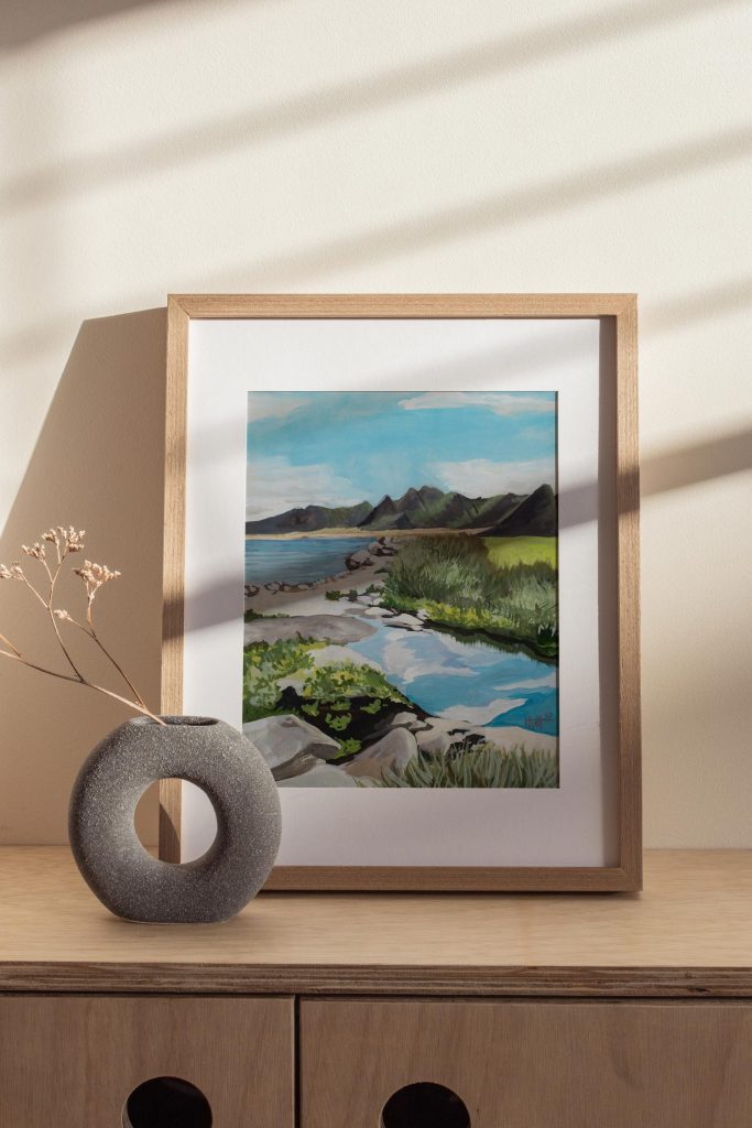
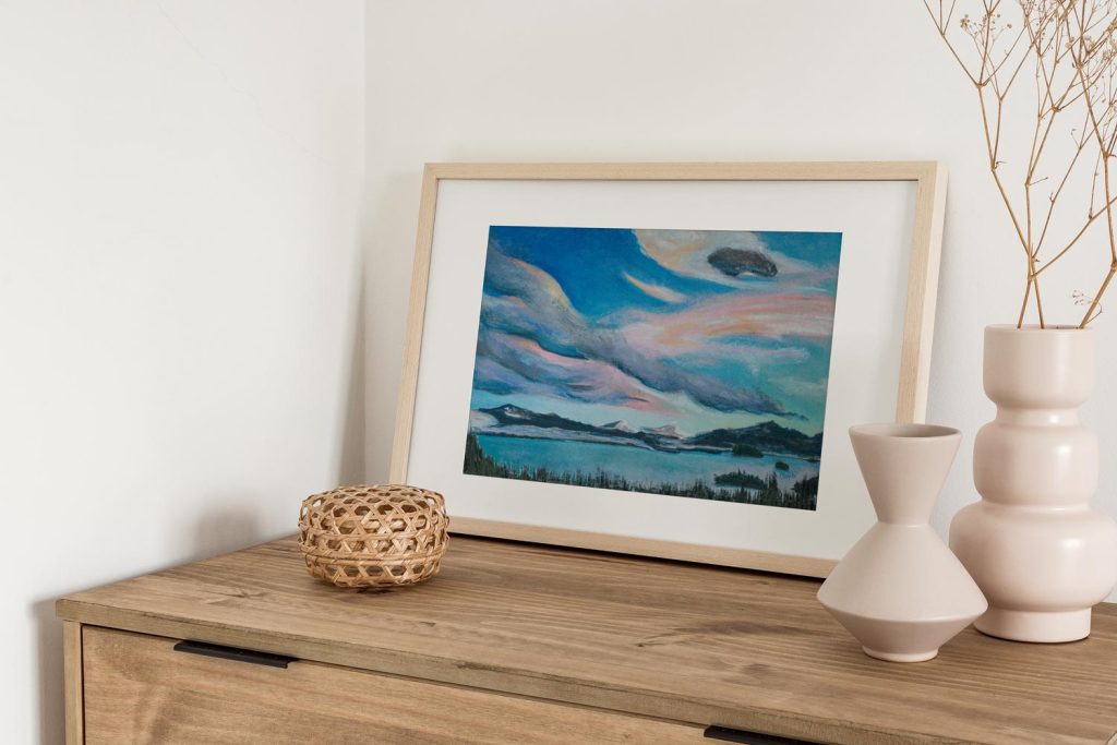
If you know me, you know I love color. Every room in our home has a least some pop of color. Wallpaper, an illustrated arch on a large wall, an accent wall, a bathroom drenched in color (Ceiling and walls all painted the same color) I even have dreams of drenching our laundry room since I spend the most time in it and like the idea of an all mauve space. (If you can’t turn your whites pink, turn your laundry room pink!) But I have years of studying color theory and understanding how pigments work. As an artist and former graphic designer, playing with color and psychology were a part of a my day to day. So how does an everyday Jane add color to her space?
Trial and error is one option, working with an interior designer is another, but Google and Pinterest also have a ton of color palettes already put together that you can pull from to make your home. Or look at homes in other countries like Italy, Spain, or Colombia. All these places know how to add color to their homes. They get that home is a reflection of your story, not the influencers you follow.
For some, the easiest (and most approachable) way to add color is through your textiles and artwork which is where Modern Magic can help out. From colorful prints to wallpaper patterns (that can also be purchased as patterns on curtains, pillows, blankets, and table runners since they’re all made through Spoonflower) allow you to add color without doing anything permanent. It’s a toe in the water to adding color to your home after years and years of Millennial Grey.