
How to Use Art Throughout Your Home: The Complete Guide to Choosing, Placing & Styling Art and Wallpaper
Imagine walking into your home after a long, stressful day. Your shoulders drop, your breathing slows, and you feel yourself relax—not because of what you’re doing, but because of what you’re seeing. The art on your walls, the wallpaper in your bedroom, the gallery wall in your hallway—they’re all working together to create an atmosphere that supports how you want to feel.
This is the power of intentional art placement. And it’s not about following rigid design rules or creating a picture-perfect space. It’s about curating a home that feels like you, tells your story, and serves as medicine for your soul every single day.
Whether you’re just starting to build your art collection or you’ve been collecting for years but don’t know how to pull it all together, this guide will walk you through everything you need to know about using art and wallpaper throughout your home. We’ll cover the practical stuff (measurements, placement, hanging techniques) and the magical stuff (choosing art by feeling, mixing patterns, creating spaces that heal).
Why Art Matters: The Science Behind Art as Medicine
Before we dive into the how-to, let’s talk about why this matters. Art isn’t just decoration—it’s medicine sitting on your walls, quietly working to improve your wellbeing every single day.
Research shows that engaging with art can:
- Reduce cortisol levels (your stress hormone) by up to 75%1
- Lower blood pressure and heart rate when viewing calming imagery2
- Improve mood and emotional regulation through color psychology3
- Decrease symptoms of anxiety and depression in clinical settings4
- Enhance cognitive function and creative thinking5
- Create a sense of connection to beauty, nature, and meaning6
When you choose art based on how you want to feel—rather than just what matches your couch—you’re creating an environment that actively supports your mental and emotional health. This is especially important in our always-on, overstimulated modern world where our homes need to be sanctuaries, not just shelters.
At Modern Magic, I’ve organized my entire art collection around this principle: shop by feeling. Want to feel grounded? Choose earth tones, landscapes, and nature scenes that anchor you. Need to feel calm? Look for soft blues, gentle greens, and serene coastal paintings. Craving energy and empowerment? Warm yellows, vibrant florals, and sunrise scenes invigorate your space.
When I enter this space, what do I want to feel? That’s the question that should guide every art decision you make.
Shop Art by Feeling: Grounded | Calm | Energized →
Room-by-Room Guide: Choosing Art for Every Space
The beauty of choosing art by feeling is that different rooms serve different purposes—and therefore need different emotional atmospheres. Let’s break down how to approach art for each space in your home.
Living Room: The Heart of Connection and Gathering
Desired Feelings: Welcome, conversation, energy, comfort, inspiration
Your living room is where life happens—family movie nights, conversations with friends, quiet mornings with coffee, creative projects spread across the floor. While so many like to say the kitchen is the heart of the house, I actually so that’s the solar plexus, the living room is the heart of the house. This space needs art that feels alive, that starts conversations, that reflects the energy and personality of your household.
Art Placement Tips:
- Above the couch: This is non-negotiable in my book—there should always be art above the sofa. You have several options:
- One large statement piece (aim for 2/3 to 3/4 the width of your sofa)
- A themed grouping of 3 pieces
- A full gallery wall that extends beyond the couch width
- Eye level rule: Stand a few steps back from the wall. The center of your artwork should be at eye level—there’s no magic number, but you want to look at the art naturally, not up or down at it
- Balance the room: Don’t put all your art on one wall. Create visual interest by placing pieces across multiple walls. Just like I paint a piece to make your eye move around the canvas, you want your eye to move around the room. Leave little nuggets of surprise throughout the space.
My Living Room Story: In our living room, we went bold with color—deep blue fireplace, terracotta chairs, patterned curtains featuring animals from around the world. (These one’s to be exact!) The art above our mantle ties these colors together while adding its own story–It’s an heirloom from my grandparents. This is what I mean by art creating cohesion: it doesn’t just fill empty space, it connects all the other design elements into one harmonious feeling.
Wallpaper in Living Rooms: Living rooms are perfect for accent wall wallpaper—try behind built-in shelving, on a fireplace wall, or to define a reading nook. Because this is a gathering space, you can be bolder with pattern here. Choose medium to large-scale patterns that make a statement without overwhelming.
Bedroom: Your Personal Sanctuary for Rest and Restoration
Desired Feelings: Calm, peace, rest, intimacy, serenity
Your bedroom is your refuge. This is where you start and end each day, where your nervous system needs to downshift, where you deserve to feel completely at ease. The art and wallpaper in this space should support deep rest and gentle awakening.
Art Placement Tips:
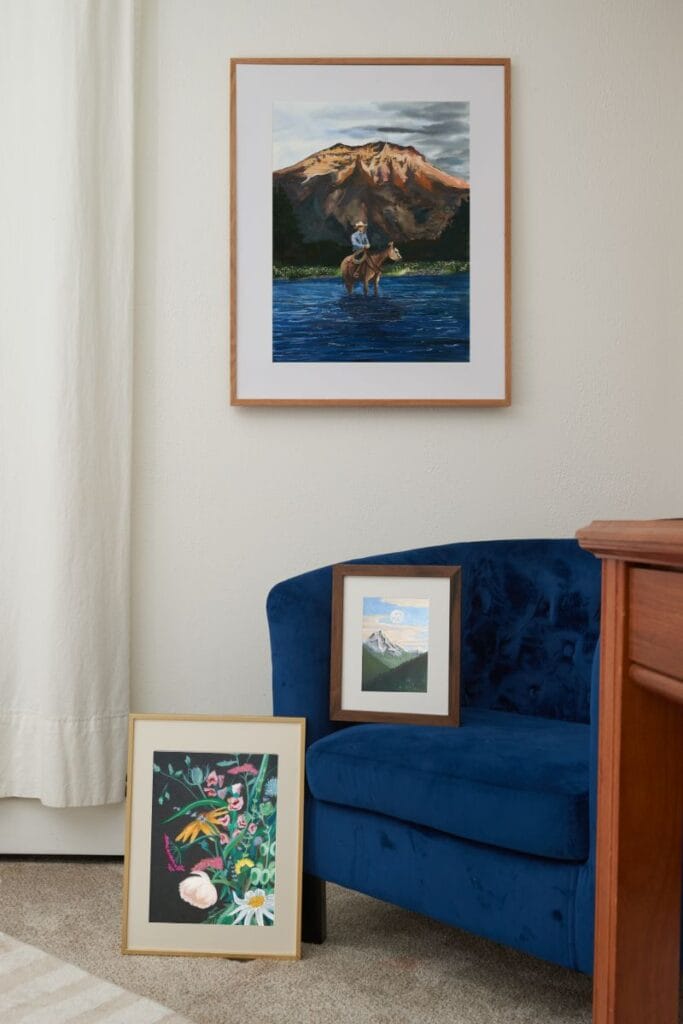
- Above the bed: This is optional, not required like the couch situation. If you do hang art here and live in an earthquake zone, use lightweight pieces without breakable glass and secure them properly to the wall. You can get playful with size and arrangement—try an off-center piece, a triptych, or even art leaning on a shelf behind the bed.
- Across from the bed: Consider what you see when you first wake up. This is prime real estate for artwork that sets the tone for your day.
- Bedside walls: Don’t forget the walls flanking your bed—these are perfect spots for smaller pieces or sconces paired with art
Choosing Calming Art for Bedrooms: When shopping by feeling for bedroom art, lean heavily into the “calm” category. Look for:
- Soft, muted color palettes (think coastal blues, sage greens, warm neutrals)
- Serene landscapes and seascapes
- Gentle abstracts with flowing movement
- Nature scenes that invite you to exhale
Avoid high-energy colors like bright reds or oranges, busy patterns, or imagery that’s too stimulating. You want art that whispers, not shouts.
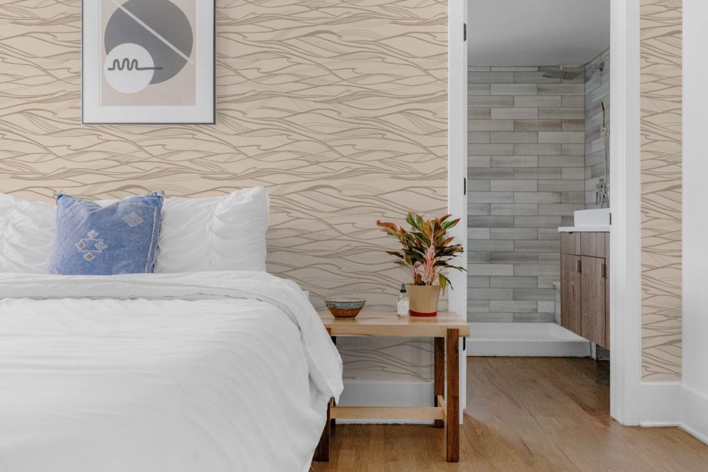
Wallpaper for Bedrooms: Bedrooms are where wallpaper truly shines. You can create an immersive, cocooning experience with wall-to-wall pattern, or try an accent wall behind the bed as a “headboard” alternative.
For small bedrooms: Choose lighter, calmer color palettes like my California Grasslands wallpaper—it adds visual interest without overwhelming the senses. Go with medium to large patterns rather than tiny, busy prints. And if you’re nervous about committing, start with just one wall before papering the entire room.
Primary Bedroom Pro-Tip: In Feng-shui the primary bedroom should face the west as this is the direction of passion. From the sunsets you’ll often get warm tones coming into the space in which case playing up these passionate tones can be a fun (and intimate) way to go. However, you might find these too invigorating and they have the power to keep you up at night, so neutralize them with blues.
Modern Magic bedroom wallpapers are specifically designed with restful color palettes that add beauty without overstimulation. Every pattern is created to help you wind down, not rev up.
Shop Calming Bedroom Art | Browse Bedroom Wallpaper →
Kitchen & Dining Room: Nourishing Body and Soul
Desired Feelings: Nourishment, warmth, community, joy, abundance
The kitchen and dining room are the stomach of the home (not the heart—that’s the living room!). These spaces are about sustenance, gathering, sharing meals and stories. Art here should feel warm, inviting, and celebratory.
Art Placement Tips:
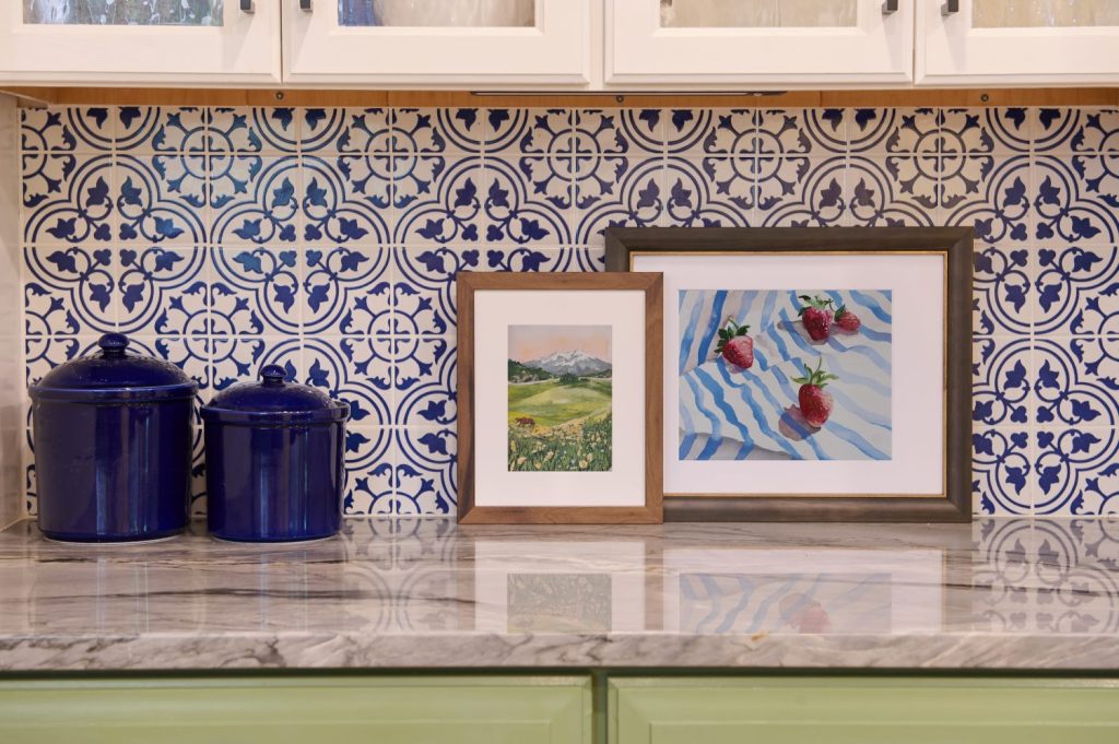
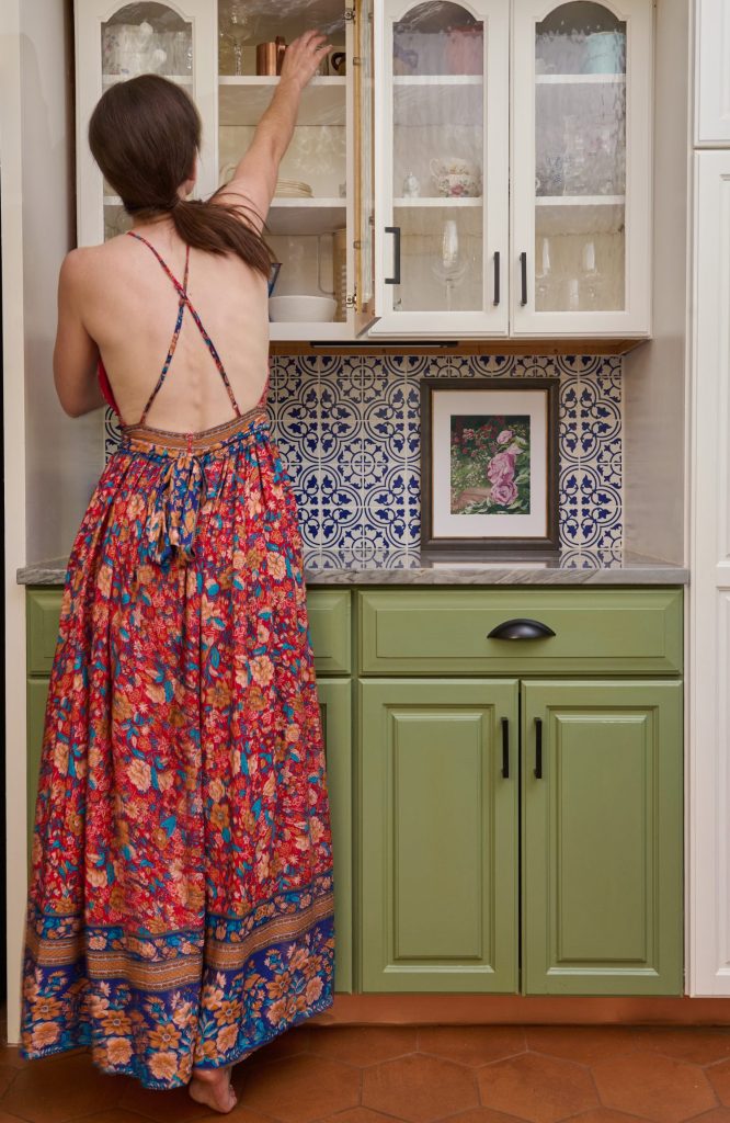
- Leaning art in the kitchen: One of my favorite tricks is leaning a framed piece against the wall on open shelving or countertops. It adds that “collected over time” feel and makes the space feel lived-in and loved.
- Dining room focal wall: Create a statement wall behind your dining table or buffet. This is a great spot for a bold gallery wall or one oversized piece.
- Unexpected spots: Don’t forget about that awkward wall next to the refrigerator or the space above cabinets
Kitchen & Dining Wallpaper: These rooms can handle bold, joyful patterns. Think botanical prints (like Honeybee Dreams), vintage-inspired designs with a twist (like Tropical Silhouettes), or geometric patterns that add rhythm and energy (Like Brown Pelicans in Sage). An accent wall in the dining room creates instant drama and makes every meal feel like an occasion.
Shop Kitchen & Dining Art →
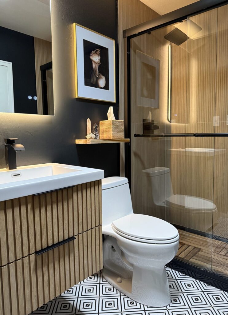
Bathroom: Your Private Spa Retreat
Desired Feelings: Refresh, cleanse, spa-like, peace, rejuvenation
Bathrooms are some of my absolute favorite places to put art, and they’re so often overlooked! Why should this purely functional space be boring? Your bathroom is where you start your morning routine and wind down at night—it deserves beauty.
Art Placement Tips:
- Gallery walls in bathrooms: I love creating messy, massive gallery walls in bathrooms. It gives people something interesting to look at while they do their business, and it transforms a utilitarian space into something special.
- Above the toilet: This is prime real estate that’s usually wasted. Hang a meaningful piece or create a mini gallery here.
- Moisture considerations: Stick with framed pieces with glass protection or canvas prints. Avoid original watercolors in steamy bathrooms unless they’re properly sealed and framed.
Bathroom Wallpaper: Small bathrooms, especially powder rooms, are the perfect place to experiment with wallpaper! With limited square footage, you can afford to be bold. These spaces have fewer “rules”—go wild with color and pattern (Try this tribal pattern for a balance fun and class). For guest bathrooms, this is where you can really showcase your personality and create a memorable experience (like with this clown fish pattern). And make it extra playful for kids bathrooms like with Hide and Seek.
Worried about moisture? Stick with a traditional wallpapers that have you add paste to the wall. This isn’t renter friendly but is more likely to stick through the extreme steam. Also, skip the grasscloth, this isn’t a friendly type of wallpaper for high traffic areas like bathrooms.
Shop Bathroom Art →
Home Office: Focus, Creativity, and Motivation
Desired Feelings: Focused, creative, motivated, inspired, grounded
Whether you work from home full-time or just need a space to pay bills and answer emails, your home office deserves art that keeps you focused and inspired without being distracting.
Art Placement Tips:
- Behind your desk: This is what you see on video calls, so make it count. Choose something that represents you and sparks conversation and think of a larger scale so people can see what’s in the photos.
- In your sight line: Place art where you can glance up from your work and let your eyes rest. This visual break is important for reducing eye strain and mental fatigue.
- Inspiration board area: Consider a wall for rotating art, postcards, inspiration—something dynamic that evolves with your current projects
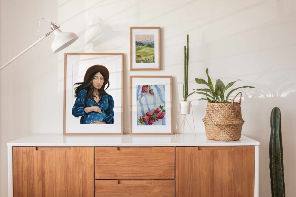
Office Wallpaper: An accent wall behind your desk creates a professional backdrop for video calls while adding personality to your workspace. Choose patterns that energize without overwhelming—geometric designs, subtle botanicals, or abstract patterns work beautifully here. (In the photograph above is California Grasslands in Terracotta)
Shop Home Office Art →

Entryway & Hallways: First Impressions and Transitions
Desired Feelings: Welcome, transition, curiosity, warmth
Your entryway is the first thing you and your guests experience. Hallways are transitional spaces that connect the different rooms and energies of your home. Both deserve thoughtful art curation.
Art Placement Tips:
- Entryway focal point: Create a vignette with one statement piece, a console table, and a few meaningful objects. This sets the tone for your entire home.
- Hallway galleries: Long hallways are perfect for extended gallery walls or a series of similar pieces that create rhythm as you walk. This is a great place to display family photos, travel memories, or a cohesive collection.
Entryway Wallpaper: A wallpapered entryway makes a bold first impression. Since people don’t spend extended time in this space, you can go bolder with pattern and color than you might in a bedroom. (Lemons and Limes is one of my favorite patterns shown above, and is perfect for this space!)
The Art of Gallery Walls: Creating Cohesive Collections
Gallery walls are one of my favorite ways to display art because they allow you to tell a story, mix different styles and sizes, and create something truly unique. But they can also feel intimidating. Let’s demystify the process.
Planning Your Gallery Wall
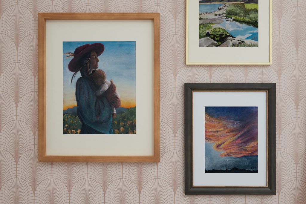
The One Thing That Ties It Together: Every successful gallery wall has some sort of through line that creates cohesion:
- All the same size frames in a grid pattern
- All frames are the same material (all wood, all black metal, all white)
- Every piece has a bit of the same color (rust, blue, green)
- Similar themes or subject matter (all botanical, all landscapes, all abstract)
- Consistent matting style
You don’t need all of these—just pick one or two connecting elements and your gallery will feel intentional rather than chaotic.
Gallery Wall Spacing
How far apart should pieces be?
If your pieces are matted and framed, they need less space between them—the mats provide built-in breathing room. If you’re using frameless canvases or frames without mats, give them a bit more space to prevent the wall from feeling cluttered.
Honestly, there are no hard and fast rules here. My best advice? Find a gallery wall you love (scroll Pinterest, visit museums, look at design magazines) and mimic that spacing as you develop your design eye. Trust your gut—if something feels too crowded or too sparse, it probably is.
Grid vs. Organic Gallery Walls
Grid galleries use all the same size frames in a repeating pattern. These feel more formal, organized, and modern. They’re also easier to plan and execute if you’re a gallery wall beginner.
Organic galleries mix different shapes, sizes, and frame styles. These feel more collected, personal, and eclectic. They’re trickier to balance but offer more flexibility and personality.
Pro tip: Lay everything out on the floor first and take a photo from above. This lets you play with arrangements without putting holes in your wall.
Mixing Framed Art with Wallpaper
Can you mix wallpaper with wall art? Heck yes! I love doing this. Here’s how to make it work:
- Use matted frames: The mat creates breathing room between the wallpaper pattern and the art, preventing visual competition
- Tie in colors: Include a touch of the wallpaper color or theme in your artwork to create connection
- Keep frames simple: With a patterned wallpaper backdrop, clean and simple frames prevent the wall from feeling too busy
- Less is more: You need fewer pieces on wallpapered walls than on plain walls—let the wallpaper be part of the composition
View My Guide To Frames →
Wallpaper Throughout Your Home: A Pattern Mixing Masterclass
Wallpaper is having a major moment—and it’s not going anywhere. Industry projections show continued growth through 2030 and beyond. Why? Because people are craving personality, texture, and beauty in their homes. Wallpaper delivers all three.
But I know wallpaper can feel intimidating. What if it’s too much? What if you get sick of it? What if it clashes with everything? Let me help you navigate these concerns.
Choosing Wallpaper That Won’t Feel Overwhelming
The overwhelm comes from two things: how the wallpaper is styled and the size of the room.
For small rooms:
- Choose lighter or calmer color palettes (like Modern Magic’s California Grasslands)
- Avoid tiny, busy patterns covering all walls—they’ll make the space feel chaotic
- Consider doing just one accent wall to ease in
- Select medium to large-scale patterns rather than micro-prints
For any room:
- Patterns covering all walls should be medium-sized with a selective color palette (not too many competing colors)
- Pay attention to the pattern’s “visual weight”—busier patterns need simpler furnishings
- All Modern Magic wallpapers are designed with carefully curated color palettes that add something special without overstimulating or competing with your décor
Remember: You can put wallpaper in just one room, on just one wall, or go whole-house if you’re feeling bold. There’s no rule that says you have to wallpaper everything.
How to Mix Patterns Like a Pro
Pattern mixing is an art form, but it follows some simple principles that make it approachable for everyone.
The Rule of Three for Patterns:
- Large print (your wallpaper, a bold rug, or large throw pillows)
- Medium print (smaller pillows, curtains, or art)
- Small print (accent pillows, throws, or accessories)
All three should have some amount of the same color—this is your through line that makes everything feel cohesive rather than chaotic.
Example: Imagine a bedroom with large-scale floral wallpaper featuring greens, blues, and cream. You might add:
- Medium striped curtains in cream and green
- Small geometric throw pillows with blue accents
- Solid pieces in the accent colors to give the eye a rest
Practical Pattern Mixing Tips:
- Vary the scale significantly—don’t use three medium-sized patterns
- Include at least one geometric if you’re using multiple organic patterns
- Bring wallpaper samples when shopping for fabrics or art to see how they feel together
- All Modern Magic wallpapers are designed with coordinating color palettes, making it easy to mix and match between collections
Can you use multiple patterns in one room? Yes! Please do! Layers of pattern create depth, interest, and personality. The key is having that color through line and varying the scale.
Wallpaper for Renters: Yes, You Can!
If you’re renting, don’t let that stop you from using wallpaper. Both peel-and-stick and pre-pasted papers are renter-friendly and won’t damage walls when removed properly. All Modern Magic wallpaper patterns are available in renter-friendly options, so you can create the home of your dreams even if you don’t own it.
Browse the Complete Wallpaper Collection →
Practical Guide: The Technical Stuff You Need to Know
Okay, we’ve covered the emotional and aesthetic aspects of using art in your home. Now let’s get practical with measurements, hanging techniques, and technical considerations.
Art Sizing: How Big Should It Be?
The Only Real “Mistake” You Can Make:
After years of working with art in homes, I can tell you there are really only two sizing mistakes:
- A tiny piece on a huge wall (it looks lost)
- A huge piece crammed on a wall with no breathing room (it feels suffocating)
Everything else is subjective and comes down to your personal preference.
General Guidelines:
- Above a sofa: Art should be 2/3 to 3/4 the width of the sofa
- Above a bed: Can range from 1/2 to 3/4 the width of the bed, or do something asymmetrical
- Dining room: A piece above a buffet should be roughly 3/4 the width of the furniture
- Large empty walls: Go big with one statement piece, or fill the space with a gallery wall
But here’s the truth: If you love a piece and it makes you happy, it “goes” with your space. The only rule that matters is whether the size works proportionally—and even that has flexibility.
How High to Hang Art
The Eye-Level Rule:
Take a few steps back from the wall. The center of your artwork should be at eye level—typically 57-60 inches from the floor to the center of the piece. But “eye level” varies based on your height and the room’s proportions, so don’t get too caught up in exact numbers.
The goal is simple: you want to look at the art naturally, without craning your neck up or down.
Above Furniture: When hanging art above furniture, leave 6-10 inches between the top of the furniture and the bottom of the frame. This creates visual connection without the art sitting directly on the piece.
Exceptions:
- In rooms where you’re usually seated (dining rooms), you can hang slightly lower
- In rooms with very high ceilings, you might hang slightly higher to balance the vertical space
- Over a bed, you have more flexibility to experiment with placement
Should Art Be Centered on the Wall or Above Furniture?
This is case-by-case, but I usually center art above furniture, especially when creating distinct nooks in a space. Centering over furniture creates visual cohesion between the wall and the furnishings below.
However, if you have a large blank wall without furniture, you’d center the art (or gallery wall) on the wall itself.
Arranging Art on Large Walls
Large blank walls can feel intimidating, but they’re also exciting opportunities.
Your options:
- One massive statement piece that commands attention
- Grid gallery wall with same-size frames for a modern, organized look
- Complex organic gallery wall with different shapes and sizes
- Leaning art on a ledge or shelf system
The gut-feeling approach:
Arranging a complex gallery wall is really a gut feeling. You’ll know when something is working because it feels balanced—not necessarily symmetrical, but balanced. Play with arrangements on the floor first, take photos, live with it for a few days before committing.
Remember your through line: same frames, similar colors, consistent theme. That’s what prevents “balanced chaos” from becoming just chaos.
Choosing Between Prints and Original Art
This is one of the most common questions I get, so let’s break down the difference.
Original Art:
- One of a kind—no one else will ever have this exact piece
- More texture, more depth, more visible brushstrokes and technique
- Higher monetary value that typically appreciates over time
- More expensive upfront investment
- Carries the energy of being handmade with intention
- Best for: statement pieces, heirloom-quality art, special spaces
Art Prints:
- Reproductions of original pieces
- More affordable, making art accessible
- Still beautiful and impactful
- Lower monetary value, shorter lifespan than originals
- Best for: filling multiple walls, experimenting with style, budget-conscious decorating
My honest take: If you don’t have the budget for an original, a print is a fantastic second-best option. Art should be accessible to everyone, regardless of budget. Start with prints in most rooms and invest in originals for the spaces that matter most to you—maybe one statement piece in your living room or a special painting for your bedroom.
Over time, you’re building a collection. Original art should be a lifelong curation, acquired piece by piece as budget and opportunity allow.
Need a specific size print for you space? I’m always happy to help with custom print orders, just reach out.
Shop Original Art | Browse Art Prints →
The Furniture-First Question: What Comes First, Art or Furniture?
Here’s the truth: there’s no set order.
Art comes after furniture if:
- You’re starting from scratch with no art collection
- Function and comfort are your first priorities (and they should be!)
- You need to establish the room’s layout before adding decorative elements
Furniture comes after (or works around) art if:
- You already have heirloom pieces or beloved art you want to showcase
- You’re building your space around a specific painting
- You have a low-backed sofa requirement because you want a large piece behind it
Most people fall into the first category—you need somewhere to sit before you worry about what’s on the walls. And that’s perfectly fine. Art collection should be a lifelong journey, not a sprint to fill every wall immediately.
Creating Art as Medicine in Every Room
Let’s circle back to where we started: art as medicine. Now that you understand the practical how-to, let’s make sure you’re approaching this with intention.
Ask Yourself These Questions:
For each room:
- When I enter this space, what do I want to feel?
- What activities happen here, and what emotional state supports those activities?
- What time of day do I use this room most?
- Do I need to be energized, calmed, focused, or inspired here?
When choosing specific pieces:
- Does this make me happy when I look at it?
- What memories or feelings does this evoke?
- Does this tell part of my story?
- Will I still love this in five years?
This is why I organized Modern Magic around feeling-based shopping. Instead of getting overwhelmed by thousands of options, you start with the most important question: How do I want to feel?
The Science of Color and Emotion
While I’m gathering more research to share specific studies, here’s what we know about color psychology:
Blues and greens activate the parasympathetic nervous system (rest and digest), lowering heart rate and promoting calm. These are perfect for bedrooms, bathrooms, and any space where you need to decompress.
Warm yellows and soft oranges stimulate creativity and optimism without overstimulating. Great for home offices, creative spaces, and kitchens.
Earth tones (browns, tans, terracotta) create feelings of stability, grounding, and connection to nature. These work beautifully in living rooms, entryways, and anywhere you want to feel anchored.
Soft neutrals provide visual rest and allow other elements to shine. They’re like a deep breath for your eyes.
This is exactly how I’ve organized the Modern Magic shop:
- Calm Collection: Blues, soft greens, gentle coastal scenes
- Grounded Collection: Earth tones, landscapes, nature-inspired work
- Energized/Empowered Collection: Warm yellows, vibrant florals, sunrise imagery
Your Home is Never “Finished” (And That’s Beautiful)
Here’s something important to remember: styling a home is never done. And when it’s done slowly, with intention, it becomes a creative act that takes a lifetime—and is well worth it.
My own living room took three years to come together. We’re still dreaming of replacing carpet with hardwood, adding more paint, maybe changing that door to the garage. There’s always something we want to evolve.
This is the beauty of the slow home philosophy.
You don’t need to rush out and fill every wall this weekend. You don’t need a perfectly styled, Instagram-ready home by next month. You’re building something that evolves with you, that grows as you grow, that tells your story as it unfolds.
Start with one room. Start with one wall. Start with one piece that makes your heart happy.
Because here’s what I know for sure: Art isn’t about perfection. It’s about creating a home that feels like you, that supports how you want to feel, and that reminds you—every single day—to slow down and witness the beauty all around you.
That’s the magic. That’s the medicine.
Your walls are waiting. What do you want to feel?
Ready to Start Your Art Journey?
Browse the complete Modern Magic collection, organized by the feeling you want to create in your space:
Shop by Feeling:
- Grounded – Earth tones, landscapes, anchoring pieces
- Calm – Soft blues, gentle greens, serene scenes
- Energized – Warm colors, vibrant florals, uplifting art
Shop by Product:
- Original Paintings (one-of-a-kind pieces)
- Art Prints (affordable beauty for every room)
- Wallpaper Collection (transform your space with pattern)
- Custom Commissions (let’s create something just for you)
Questions? I’m here to help you create a home that feels like medicine for your soul. Reach out anytime.
- Kaimal, G., Ray, K., & Muniz, J. (2016). Reduction of Cortisol Levels and Participants’ Responses Following Art Making. Art Therapy, 33(2), 74-80. ↩︎
- Law, M., Karulkar, N., & Broadbent, E. (2021). Evidence for the effects of viewing visual artworks on stress outcomes: a scoping review. BMJ Open, 11(6). ↩︎
- Babin, B.J., Hardesty, D.M., & Suter, T.A. (2003). Color and shopping intentions: The intervening effect of price fairness and perceived affect. Journal of Business Research, 56, 541-551. ↩︎
- Abbing, A., Ponstein, A., van Hooren, S., de Sonneville, L., Swaab, H., & Baars, E. (2018). The effectiveness of art therapy for anxiety in adults: A systematic review of randomised and non-randomised controlled trials. PLOS One, 13(12).
↩︎ - Bolwerk, A., Mack-Andrick, J., Lang, F. R., Dörfler, A., & Maihöfner, C. (2014). How Art Changes Your Brain: Differential Effects of Visual Art Production and Cognitive Art Evaluation on Functional Brain Connectivity. PLOS One, 9(7). ↩︎
- Richardson, M., et al. (2022). The nature connection handbook. University of Derby.
Moula, Z., et al. (2022). Nature-based art therapy research: A scoping review. Frontiers in Psychology.
Brown, D. K., Barton, J. L., & Gladwell, V. F. (2013). Viewing nature scenes positively affects recovery of autonomic function following acute-mental stress. Environmental Science & Technology, 47(11), 5562-5569.
↩︎